Risk
Progress involves exposing ourselves to and considering the impact or forms of danger, harm, uncertainty or opportunity.
27 May 2019
For our Grade 6 unit on Risk, we looked at the risks a loosely allied group of French painters at the beginning of the 20th century took to separate colour from its descriptive, representational purpose and allow it to exist independently on the canvas. It seems a quaint idea now to use colour to project a mood or to use colours that are not true to the natural world, but just over a century ago, the idea and practice was so revolutionary that it earned these artists the derisive nickname les Fauves, ‘wild beasts.’ Influenced by the work of Van Gogh, Gauguin, Seurat and Cézanne, artists including Matisse, Derain, Rouault, Braques, and de Vlaminck used bright, saturated, ‘unnatural’ colours to seek a new picture space defined by colour planes.
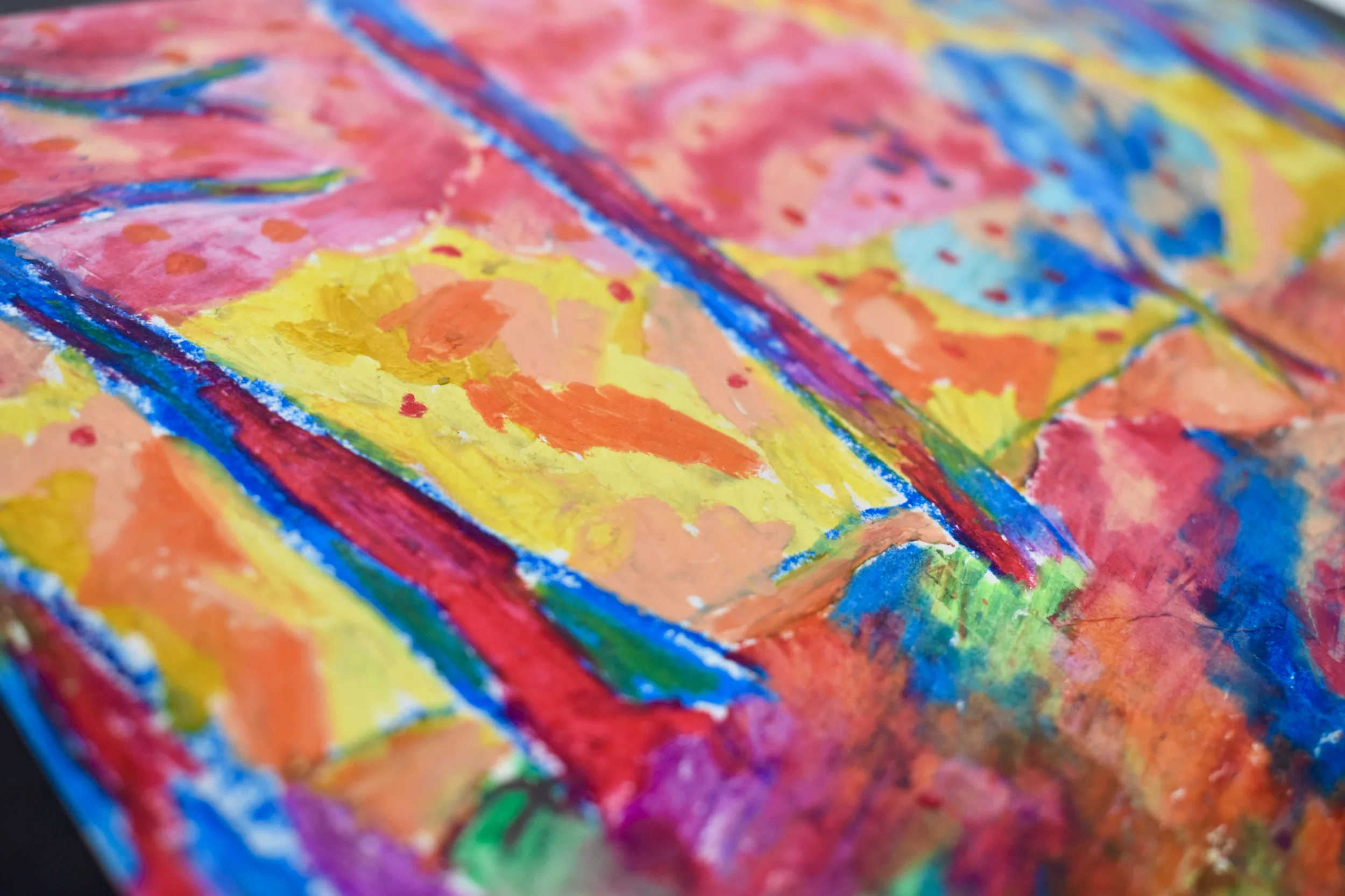
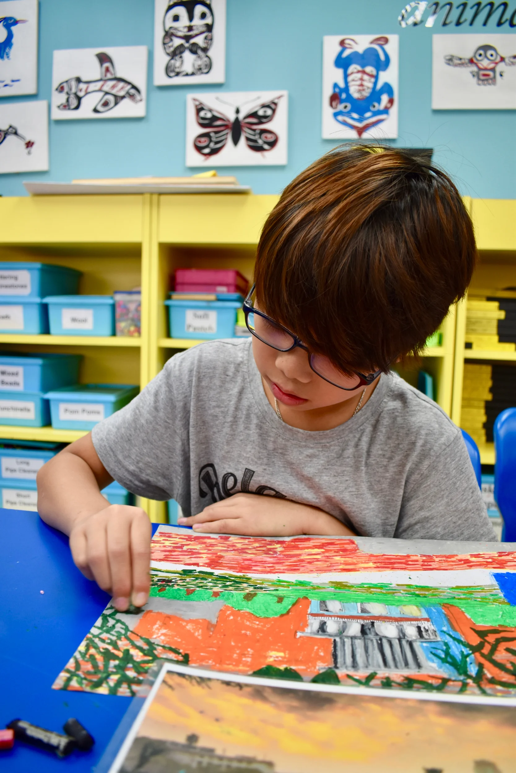
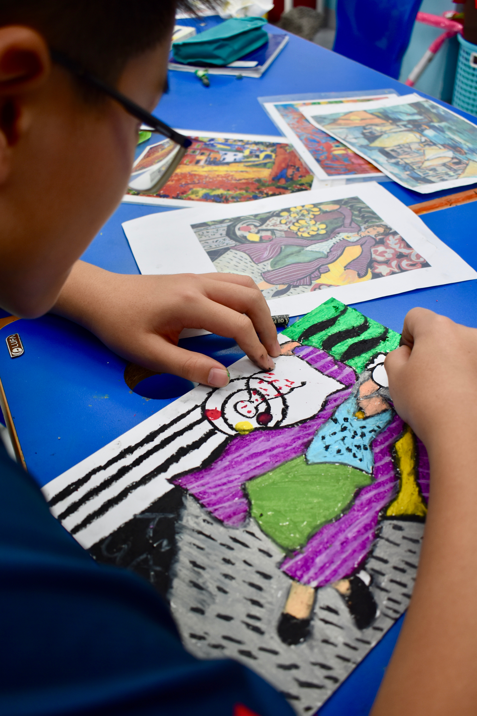
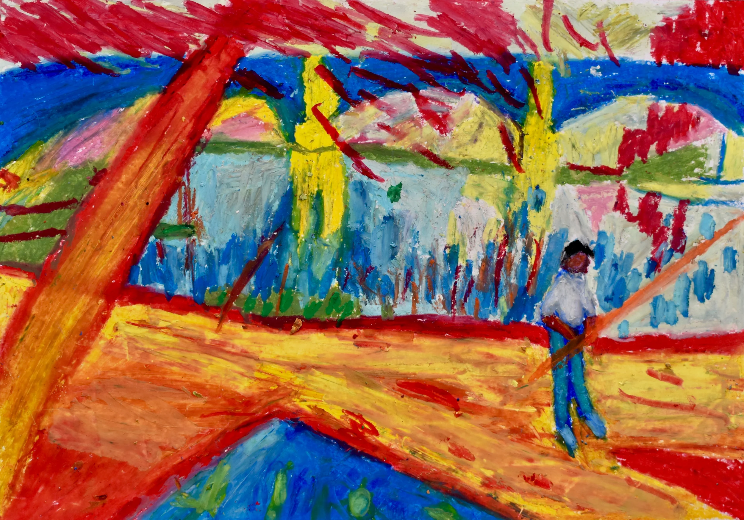
Fauvism was an important precursor to further modes of abstraction explored in the first half of the 20th century, but the idea of approaching colour with abandon is one I bring to my own work as an artist, and this is why I enjoy introducing this art movement to my students. To better understand the Fauvist process, we transcribed paintings by Maurice de Vlaminck, considered by some a ‘natural’ Fauve because his use of intense colours reflected his own exuberant nature. In this first step to making students feel more comfortable taking risks with colour in their own artwork, I challenged my students in their transcriptions to lay down colour decisively and energetically, using their intuition; to outline, simplify, to not paint in every detail.
I sourced some tips for painting like a Fauve from LiveAbout, which we used as a helpful set of guidelines for achieving the rich and colourful look of a Fauvist painting:
Paint everyday scenes or landscapes.
Use bright, saturated colors, including colors straight from the tube.
Don't worry about creating the illusion of deep space. Let your pictorial space appear flatter and close to the surface of the painting.
In order to create a bit more three-dimensionality, use warm colors in the highlights and cool colors in the shadows.
For a dynamic look and to create visual impact and focus, use complementary colors next to one another.
Don't blend your brushstrokes. Make your brushstrokes visible, bold, and energetic.
Simplify. Do not paint in every detail. Edit out what it is not critical to the emotion of the painting.
Outline many of the shapes in black or blue.
Use a decisive and energetic stroke that may or may not reveal the painting surface between the strokes. Don't feel the need to fill in every space on the painting surface.


